Chair is a banking app that provides equity in financial services.

Mainstream banking services are too costly and lack equal opportunities. How can Chair provide accessible and educational ways to low-income communities to help them manage their finances? Financial institutions servicing low-income communities do not have the budgets to make digital tools widely accessible to their customers. By integrating with the local bank systems, Chair hopes to become the digital banking tool servicing low-income communities.
To gain additional insight into the domain, exploratory research was conducted. It was clear quickly Chair had no direct competition with that specific target user. Given that discovery, indirect or adjacently similar companies were researched to gain insight into their product offerings as well as their brand.


Banking costs average up to $349 per year, where most households have less than $500 in savings.

In 2017, an estimated 6.5% of American households were “unbanked”.

African American consumers are 73% more likely than white consumers to lack credit score. They also face discrimination in credit access based on where they live, this is also referred to as “credit redlining”.

In 2019, more than three-quarters of Americans used a mobile device to check their bank balance. Additionally, in the low-income sector, Android devices are more accessible and affordable.
UI
Features
Before jumping into product design, I began the visual exploration for Chair by developing three divergent style tiles. Considering the company’s mission to provide an inclusive and straightforward banking experience, I wanted Chair’s interface to embody a trustworthy and neutral color scheme, highlighted with blues, teals, and beiges. I brought in curvature and roundness to shape the buttons, tiles, and cards and incorporated breathable san-serif typography with subtle hints of serifs to help differentiate Chair from the existing banking apps.
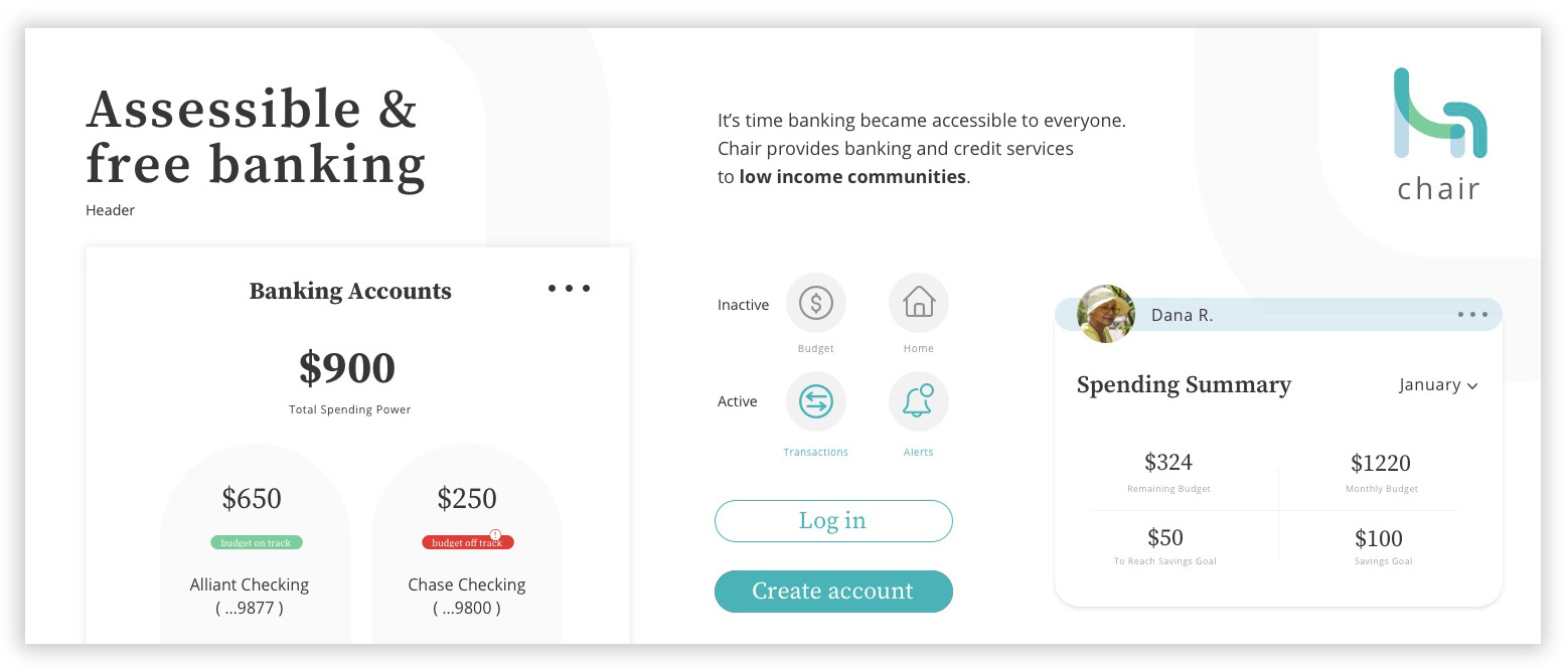
Trustworthy, inviting & subtle
The use of a Serif typeface is the key differentiator in this tile. The design brings in oval like cards styles and simplified iconography. The light base colors and the deep teal hues feel inviting and trustworthy.
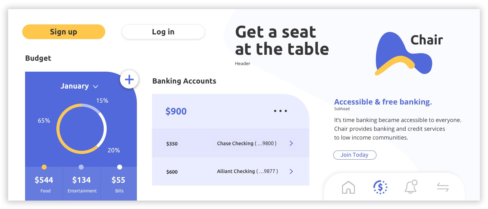
Bold, Confident & Abstract
Curved and abstract shapes set the tone for this tile. Blues are used to highlight important account stats and data, while the yellow acts as an accent hue distributed amongst the main CTAs and graphs.
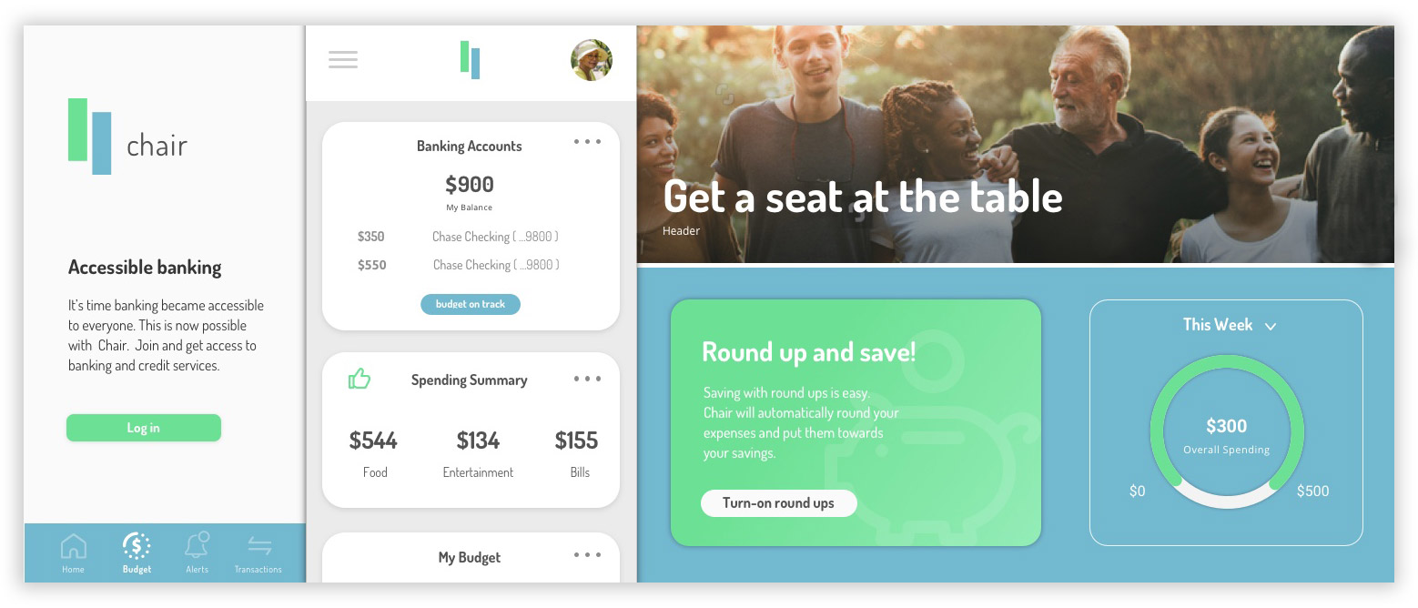
Inclusive, comforting & encouriging
This visual approach bridges subtle gradients to ground the tiles and warm, upbeat photography to give the design a perosnable look and feel. Grays and whites are used as the base colors.
-17-55 year-olds in the low-moderate income population
-Minorities that are left out of the mainstream banking sector
-Many are unbanked (not using banks)
-Users would have approximately 3-5th grade level of math understanding.
Testing indicated that the “Trustworthy, inviting and subtle” style tile was preferred amongst the user group. This was a clear signifier that the visual theme was universally accepted among a younger and older audience.
After synthesizing the provided feedback, I distilled a few major pain points and usability issues:
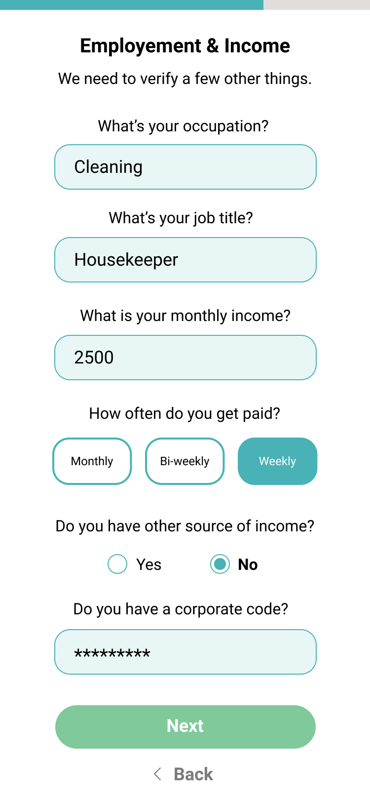
The client and I prioritized key product requirements to include in the first version of the Chair app. These key product requirements included and ability to quickly open banking and credit accounts, access to educational budgeting and finance tools, and a streamlined onboarding process.
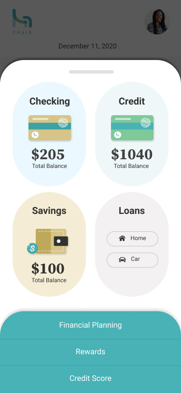
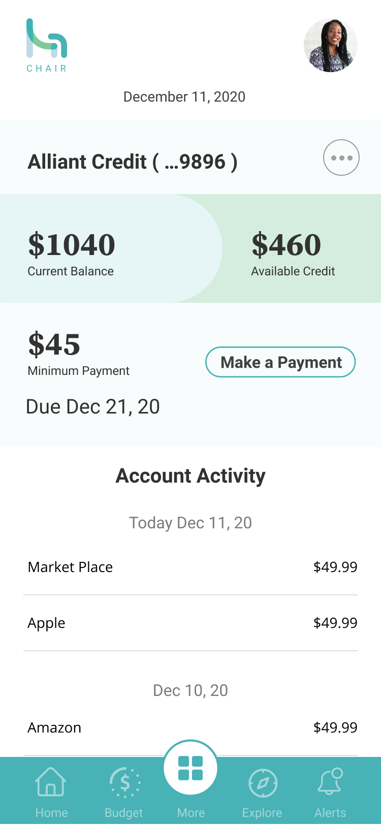
Accounts Snapshot
The account dashboard is easily accessible right from the bottom navigation. It provides glanceable financial information along with important account alerts. It’s presented in a card-like layout with the key financial information emphasized to help with scannability.
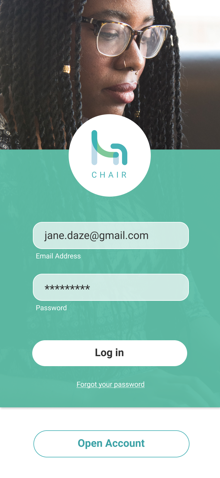
Streamlined Onboarding
Chair’s onboarding is easy and fast, the Welcome Screen visually synthesizes the “open account” user flow into 4 easy steps.
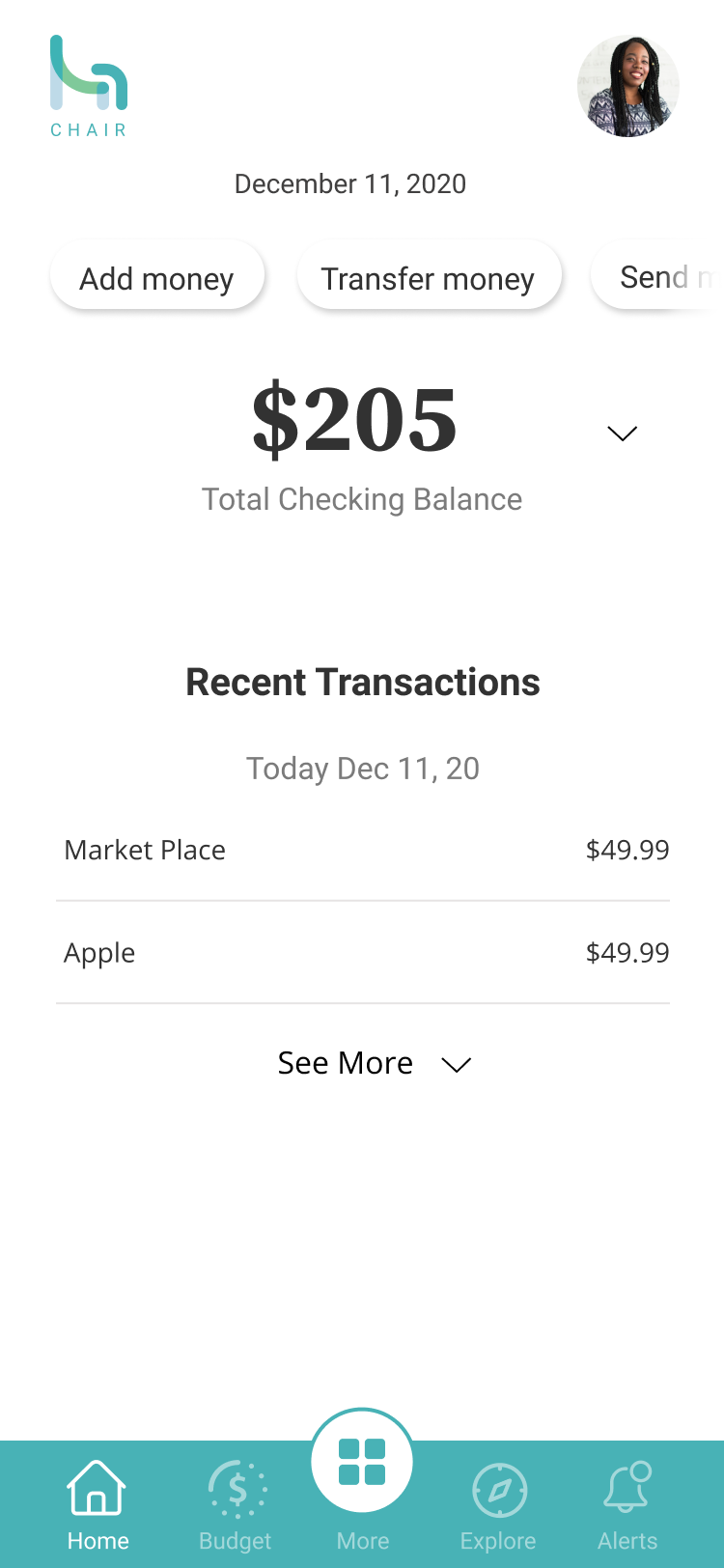
Bottom Navigation
I’ve leveraged the bottom navigation system to nest all of the key pages.
Quick Nav
In addition to the bottom navigation, I wanted to incorporate a quick top nav to make account operations such as transferring funds or depositing checks easily accessible.
Due to limited resources, user testing was conducted on the final round of high fidelity designs. Therefore, the first round of wireframe designs was solely analyzed by the client. Together, with the client, I revisited the current product features and identified key design improvements to implement in the next round of testing. These iterations included budget tracking, make a payment feature, and navigational changes.
Synthesis from the testing revealed that the app was easy to follow and the information along with the navigation was well organized. The color palette was calming and comforting while the iconography and typography were clear and easy to digest.
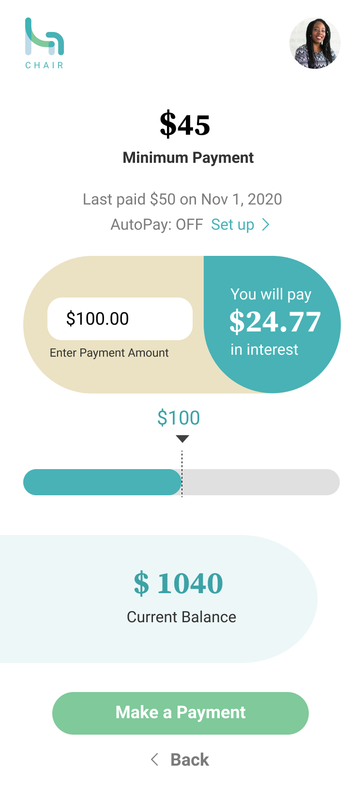
“I like that the interest is visible during the payment set up as opposed to tacked on after the payment has been made and processed”
“The graphics are helpful to see the suggested spending versus actual spending.”
“The information was clear and the icons made it simple to understand what each option does”

Budget screen that provides financial education and budget tracking

Re-visiting and adjusting the bottom navigation layout and interactions to include a navigational pull-up screen that holds key account tiles

Including the “Make a Payment” feature with visible interest breakdown
While the feedback was clear and actionable, and I was able to address an important labeling issue on the budgeting screen as well as further define “banking” within the app, a few items remained and are in need of further validation:

